Showing posts with label books. Show all posts

Saturday, 10 March 2012

Wednesday, 21 December 2011

The mysterious case of the Christie typeface

My wife likes to read books in the bath. Due to this we have a growing collection of charity shop bought Agatha Christie books on the windowsill of our bathroom, with the paper getting slowly damaged by the changing humidity therein.

Apart from worrying about the condition of the books, I haven't really paid much attention to this collection until the other day. For some reason I decided to check out the covers, and I immediately noticed the lack of cohesion in the choice of typefaces used. This is particularly striking when looking at the one consistent feature of these covers; Agatha Christie's name. To illustrate my point, below are scans of a selection of our bathroom books ranging from 1956 to 2002 .

1956

1960


1971

1976

1980

1981


c.1995 (American edition with no date in book—1995 noted on price tag sticker)

2002

As an experiment, before scanning these in, I laid them out in the order I thought they were released in, based on the choice of typeface. Apart from one—the 1980 Helvetica rendering that I thought was late 1960s—I got the order spot on.

Considering the attention to detail that is lavished on TV adaptations and films of Christie's work, in terms of getting date specific references for architecture, clothing and product design correct, I find it interesting how typographic details on these books are rooted in the time of the reprint's release, rather than paying any attention to the context of the book.

Saturday, 26 November 2011

Underneath the cover, the…

Over the summer, for some reason, I ended up reading a lot of hardback books. Biographies and autobiographies mostly. Doing so, I got to thinking about dust jackets, and how most were really poorly designed, and were only there to make the book stand out on Waterstones' bookshelves. These flimsy paper wraps really don't offer any real protection to the hard casing, as was their original intention.

How these jackets helped the books stand out from other biographies seems difficult to comprehend as well, considering many follow a pattern of large cropped portrait of the author/subject with large sans serif type writ large, such as the cover for Andy Kershaw's painfully honest autobiography.


On removing these covers, and I always take a peek, you generally discover an equally dull hard case with the title printed large on the spine.


Interestingly, at the same time I was having these thoughts about dust jackets, Ben Terrett of Noisy Decent Graphics blogged about the topic, stating that the first thing he does on getting a hard backed book is to throw away the dust jacket, (link below).

I can see his point, but I prefer to keep mine covered, despite the fact that the jackets become tatty over the course of reading the book. The main reason being that the flaps work as great place savers. I'm not a fan of book marks or torn scraps of paper wedged in between pages. I somehow lose them during the course of reading a book—I'm never quite sure how this happens because the book marks should surely stay with the books! Also, I'm never quite sure what to do with them when I'm in-between books. Paperbacks aren't a problem, as I commit the mortal sin, (according to some people), of turning down the corner of the page I'm on. Unless, of course, it's a book I've borrowed—I do have some respect.

So while I do see dust jackets as mostly pointless, they do have their uses. However, what does really annoy me is when the dust jacket is exactly the same as an image wrap on a hard case. The otherwise excellent Design Series Format by Brian Webb is a perfect example of this.


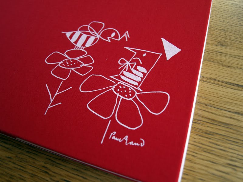
However, there are gems out there that demonstrate how dust jackets can become an integral part of the design. For example, Ann and Paul Rand made the most in their children's books, Sparkle And Spin and Little 1. Sparkle And Spin literally sparkles, by incorporating a glitter ink as an element within the design.


And if you take a peak underneath the jacket, which I always do with any books I pick up, you find the image wrap is different from the jacket and there's the lovely personal touch of the author's signatures.


In the case of Little 1, no pun intended, when you remove the jacket, you discover a rather lovely illustration on the red cloth bound book.


Despite liking the image itself for its simplistic beauty, what really chimes with me about this is that it makes the whole book interactive, and creates a reveal within the construct of the artefact. As both child and adult, this tactic has always engaged me and made me feel more personally attached to an item. That act of discovery on the part of the user is an important design device that helps to bond them with the product on a deeper emotional level. Without the dust jacket, this would just become the cover image—nice as it is—but I wager it wouldn't carry the same impact.

Of course, designers should always be looking for ways to utilise all components, especially in times of environmental concerns. The Design Series Format books seem incredibly wasteful when thinking along these lines. If you insist of having a dust jacket that is going to be printed on, then at least do something with it. An example I came across several years ago is Change The World For A Fiver, which incorporates a poster on the inside of its dust jacket.


I thought it strange when I bought it that this paperback book should have an extra wrapper, but on getting it home and looking under the cover, I discovered why.

A more recent example I've found is The Beach Beneath The Street by McKenzie Wark. This is in keeping with the situationist metaphor, 'underneath the paving stones, the beach', (referring to the sand beneath the paving slabs that student demonstrators, in Paris May 1968, ripped up to throw at riot police). The difference being that in book form, underneath the book jacket lies a graphic novel, which helps to contextualise some of the theories contained within the writing in the book.


Links:
Wikipedia on dust jackets
Ben Terrett on dust jackets
The dust jacket is dead, according to the Guardian in 2010
Buy old dust jackets

Tuesday, 26 July 2011

Printing for all


I haven't been to the Museum of East Anglian Life for a few years so it was a joy to see that they are slowly but surely making lots of improvements for visitors when I was there this weekend. They are even running printing workshops, brilliantly titled Printing For All, in their mock up of an old print shop. This holds several small letterpress machines and a lovely Columbian Press, as seen on the flyer above.


I also found this book in the replica corrugated iron school/chapel. I was immediately taken with the endpapers.

Link:
Museum of East Anglian Life Stowmarket, Suffolk.

Tuesday, 4 January 2011

First edition


I was relieved to return home to find the first edition of McJunk back from Blurb and all's well. I was slightly concerned that there might be reproduction issues after the 'preview' on Blurb made the book looked muted. So I turned off the preview, not wanting to put off potential buyers, and crossed my fingers.

Well the reproduction is as good as the test prints I got through last month so I'm not sure what's going on with the preview—I shall leave it turned off.

The design decisions I made after the test prints have also paid off. Dropping a couple of pt sizes on the text and knocking it back to 80% black was the right choice, as was removing the Polaroids.


All things considered, I'm generally pleased with the results. Now to save up some money to buy review copies to send out.

For more photos of the book, head over to the McJunk Facebook page.

Saturday, 1 January 2011

Monday, 4 October 2010

978-0-9567146

I'm one step closer to adding a publishing wing to Dubdog as I received my ISBN prefix through today. I've never, ever been so excited about numbers as I was when I got the email earlier today, being math phobic as I am. I now have an Excel file, (something else that is rare) with 10 shiny ISBN numbers awaiting something to be attached to them.

Next up is registering with Nielsen's online publishing service, which carries a 5 day wait, so I can register the paperback version of McJunk with its own ISBN.

As for the book itself, I've been refining the introduction again. It was my colleague Dave who told me that 'writing is rewriting', and how true he is. It is definitely improving with each draft and I'm pretty much there with most of it, except for the last paragraph that is. This I'm really not happy with at the moment but I'm fairly certain I'm within grasp of nailing it.

Lastly, I imported the text into the InDesign file yesterday and was relieved that the text still fits the space allocated for it despite these umpteen rewrites.


Monday, 20 September 2010

ISBNed


The current incarnation of the McJunk (large) cover, subject to change.

McJunk is a step closer to publication now that I've actually ordered ISBN numbers for it. I say 'numbers' because as a new publisher I can't buy a single ISBN, but have to order a batch of 10. As I'm publishing two versions of McJunk, I'll have to find eight other books to publish under the Dubdog moniker to use up the remaining ISBNs. Hmmm, I feel an anthology of Bum Gravy and Pindown lyrics coming on. Or maybe not.

The two versions will be:
McJunk (large), 200 x 250mm, hardback, 80pp, full page photographs printed on premium paper.
McJunk (regular), 200 x 250mm, paperback, 40pp, multiple photographs to a page, paper as yet undecided.

The large version will obviously be of superior quality and cost considerably more than the regular version. It will also be deleted after an as yet undecided number of sales.


Imprint page awaiting ISBN number

Once the ISBNs are through, there are barcodes to order, and then I'm pretty much ready to publish after a final proof read, sorting the folios and ordering a proof copy from Blurb.

As in previous posts about McJunk I've decried the slow progress of this publication. So I've decided smaller, but more regular bursts of activity are much more likely to get this project completed while I've got other more important responsibilities to deal with (i.e. paid work).

Updates to follow as progress advances.

Thursday, 18 March 2010

The Prelude


Another one of Claire's great charity shop finds: a 1904 edition of Wordworth's The Prelude. Above: illustrated prelude page to The Prelude. Below: Gold leaf spine and embossed hardcase.

Sunday, 7 February 2010

Aspects and directions

This weekend I bought this 1964 gem. It cost me £5 in an otherwise overpriced second-hand bookshop in Holt, Norfolk. Not sure what 10/6 equates to in today's money but it's the best read of the year so far and worth every penny.