Showing posts with label graphicdesign. Show all posts

Wednesday, 11 April 2012

Split identity

Split identity by Dubdog@Flickr
Split identity, a photo by Dubdog@Flickr on Flickr.

Claire and I visited the Scottish National Gallery of Modern Art today, and as well as being impressed by many of the exhibits—the Edvard Munch and accompanying Graphic Art exhibitions are well worth a look if you are any where near Edinburgh—I was duly taken with its identity system.

Designed by Glasgow based O Street, they have aligned all the 'O's, (their website reveals an slight obsession with 'O's, as their name may suggest), something I didn't notice at first. This allows a neat, right aligned edge, with which to split the logotype in two, emphasising the fact that there are two galleries to the Modern which are split into different buildings separated by a road.

Before realising this, on seeing the half written gallery name on a sign as we approached the building the Munch exhibition was housed in, I thought it interesting, but a little gimmicky. A bold move, I thought, as I wondered how they ever managed to sell the idea of only displaying half the clients' name to the client. However, it all made sense very quickly when walking around the two sites, especially when seeing the two halves so closely situated, as in the above photograph, and I am now an ardent fan. I can imagine the fun they must have had in dreaming up different situations where they could exploit this visual game, and thus reinforce the concept to visitors to the gallery.

Check out more examples on my Flickr and the O Street website.


Friday, 6 April 2012

The Small Letter


The Small Letter is a type primer produced by Desmond and Libertad Jeffery in 1956. It was donated to the BA (Hons) Graphic Design course at UCS for its book archive recently, along with various other books, and it has become an object of fascination to me. With an introduction that states: "We do not expect this booklet to be of any use to anybody, except possibly as a Dreadful Warning to the thoughtful against undue distortion & ornamentation of basic letterforms," how could it not?


So intrigued by this, and other such books that have either been donated or I've personally acquired, that I have started a research/archive project on Tumblr. At this stage, I'm intending it to consist of pre-digital print, type, and graphic design related books, although this may change depending on what I uncover. The blog is titled after Jeffery's booklet.


Sunday, 18 March 2012

Recommended

Terence Conran exhibition end quote

I highly recommend the Designs Of The Year 2012 and Terence Conran: The Way We Live Now exhibitions at the Design Museum after spending a few hours there yesterday. They make a great double act, in fact. Catch them both while they are on together.

See below just one example of the nominations for the Design Of The Year Award that perfectly illustrates Conran's quote above. While I would love Gordon Young and Why Not Associates' excellent Comedy Carpet to win, this one is going to be hard to beat, in my opinion.


The Awards will be announced on 24 April. Even if Comedy Carpet doesn't win overall, it'll have stiff competition in the Graphic Design category, running against what I consider to be the book of last year, Beauty Is In The Streets: A Visual Record Of The May '68 Paris Uprising.


Saturday, 25 February 2012

Journalism [sic]

A week is a long time in blogging, and certainly too long to react to a newspaper article from last Sunday, especially when so much has been said elsewhere. And although when I read John Naughton's piece in the Observer, titled: 'Graphic designers are ruining the web', my reaction was immediate and I wanted to post about it, a busy week has got the better of me. But it is still in me, and I need to get it out. So as I snatch a few moments here, (still busy—more on that in a later post), find below a direct rebuff to Mr Naughton, in bullet points:
  • Good design recognises the need for accessibility in web pages and will allow for users to customise a page or switch to a text version should there be a need. Blame Flash and designers who design for themselves above the end user, not graphic design per se.
  • On the "print counterparts" comment: The Guardian website's print counterpart is one of the best designed newspapers ever. Unfortunately, I don't have time to go into why, I'll save that for another post, but needless to say, The Guardian understands the value of design, both in print and online. Just speak to the head of the design department next time you are in King's Place and he'll tell you why.
  • Technology has allowed for better web design, and more image rich sites, granted, but good design still considers download times and bandwidths. Again, blame inconsiderate designers if a page doesn't load, not the trade they ply.
  • You don't consider visual language to be information? Hmmm. Then you probably have never even considered that there is a language system to be decoded in graphic signposting systems. This also implies you clearly don't understand semiotics. You therefore do not have the knowledge to be able to judge such things.
  • The bit about Flickr and Futurists—your point here is what, exactly?
  • "I'm a minimalist: I value content more highly than aesthetics." This is an oxymoron. Minimalism is an aesthetic design decision, not a by product of a lack of a thought process.
  • The website you champion is a navigational disaster and clearly doesn't present a friendly interface or clear understanding of information hierarchy. Pity the dyslexics who would like to access its content.
  • It is not the designers who dictate the content of websites, so why even mention 'LOLcats' and Internet shopping?
As I've said here before, and it is one of the central themes through the essay I wrote to accompany my McJunk book, graphic design is a much maligned discipline, and there are good reasons for this. But if graphic design is going to get a kicking, then at least let it be critically informed and not a piece of nonsense such as this article is. And so, to one last bullet point:
  • Poor research and inadequate understanding are ruining journalism.

Wednesday, 15 February 2012

The power of print

What started out as a bit of a shitty day, literally—I trod in dog shit on the way to Ipswich Station and got crapped on by a bird on the same walk—ended up being a great, but busy day. Firstly, I took 20 second year UCS Graphic Design students around a print works. Alphaprint in Colchester, once again, pulled out the stops and gave a fantastic tour of their fascilities. This is the second year on the trot that they've given this tour, and the students were fascinated and learnt a lot from seeing printing and finishing processes in action.


Students smell the ink on a 5 colour Mitsubishi.

Then I hot footed it across town to meet with my colleague, Russell Walker, who had arranged a talk by Abram Games' daughter, Naomi Games, of her father's work to final year graphics students. She told many a tale about his incredible life and strong willed nature, as well as discussing airbrushing (with an impromptu [dry] demo from Russell), and other techniques.


Naomi Games talking about her father.

The show is currently at The Minories Gallery in Colchester and well worth a visit, but be quick, it comes down on Monday 20 February.

More photos to follow on Flickr soon.

Sunday, 5 February 2012

And the title of the next programme is…

I've recently noticed a major lack of quality control in title sequences for some of the BBC's output. This is despite the continued excellence of some of the programmes. Take, for example, this atrocious piece of typography for Go West, a Friday night BBC4 programme that is currently running, about British bands 'making it' in America.


It appears as if the producer has allowed a GCSE work placement student to knock this together in iMovie, as the type slowly pans down the screen while images of adoring audiences at rock gigs in USA stadiums fills the background.


Unfortunately, the overall effect of the sequence just gives the impression of being 'cheap'. It is as if these type of BBC4 'talking heads' programmes have had the majority of their budget spent on paying guest speakers, while stitching together archive footage from the Beeb vaults. Hmmm, I'm probably not far wrong in this assumption.

The first title sequence that made me choke on my tea for its complete lack of aesthetic consideration was Timothy Spall's Somewhere At Sea. Be thankful I wasn't able to find an example online to post here. Like Go West, I'm sure it wasn't a big budget affair, but it did showcase a BBC veteran of high regard. Much like the programme that really did make me wonder what was going on in the minds of the graphics department at the BBC; Stephen Fry's Planet Word.


Comic Sans, please! This programme was dedicated to language—one episode even looked at the visual side of sign language—and yet the designers seem to have completely dismissed the importance of visual language in its title sequence. This is even more baffling when given that some effort had gone into the trailer, which at least attempts to smpathetically visualise and authenticate the subject matter being discussed.


Now I understand that the same level of design savvy can't go into everything, and that not all budgets will cover getting Why Not Associates to do the titles, (see Life On Mars and Ashes To Ashes), but the issue is that you don't need to spend lots of time and money on making a considered and understated piece of typographic communication as this is more about rudamentory design choices—things that second year undergraduate graphic design students are adept at. And they are decisions that I am paying my licence fee for. You can seriously undermine the entire credibility of a TV programme with this sort of basic insult to your audience's intelligence.

Finally, don't get me started on the end titles; I'll leave that particular rant to David Mitchell, who is much more adept at such things than me.


Sunday, 29 January 2012

KC&CO—FO


Ever since it started appearing everywhere about two-three years ago, I have had a problem with the poster 'Keep Calm and Carry On'! The basic premise of the piece is that you should accept your lot, never object to anything, and continue with the status quo as if nothing had changed. Adorned in shop windows and dressed up as an admirable trait of the British psyche, the concept that adversity is something to shrug off by being quietly subservient, actually makes me angry. The idea that ignoring our problems and not questioning the root causes will somehow 'fix' everything, in my mind, is tantamount to telling children not to do anything if they get bullied in the school playground. Should we also accept a bit of racism now and again as well? It is bad enough that this poster, (supposedly), became an ironic statement on how people felt about an economic system collapsing around them, but when the current edition of Creative Review puts the phrase at number 12 in a 'top 20 slogans of all time poll', I am incredulous. (And that is not just because my vote for Cresta's, “It's Frothy Man”, didn't get a look in.) The insidiousness of this poster is made even more apparent in the accompanying article. Apparently, commissioned by the Government's Ministry of Information in 1939, it was never released, despite the Government stockpiling 2.5 million copies, and was only intended to be pasted up around the country should Britain be invaded during the burgeoning war with Germany. Therefore, its intention was to tell people to accept their fate and to not challenge their new Nazi leaders—as if I didn't like it enough before I knew that, I now hate the poster even more. I'll be tempted to smash any mugs I see with it printed on as well from now on.

It is not just me who sees the insipid side of this graphic blinkering. Justin McGuirk argued in The Guardian, "Take that odd phenomenon, the "Keep Calm and Carry On" poster that has been ubiquitous since the credit crunch. In its appeal to the plucky stoicism of the blitz years, it seems designed to dampen down any unrest aimed at the political-financial establishment." These thoughts led me to think about other graphic conditioning statements, albeit in fiction. The KC&CO shares a resemblance, in intention at least, with George Orwell's 1984 doublethink sloganeering; War is Peace; Slavery is Freedom; Ignorance is Strength. Likewise, in the 1968 TV programme The Prisoner, hung throughout official buildings were the slogans; Questions are a Burden to others; Answers a prison for oneself.


Jon Gray's cover for George Orwell's 1984 (Penguin Books)

So why rant about this now, other than because Creative Review sparked a renewed hatred for the poster. Well, the article coincided with a piece on the Creative Review blog about the launch of Occupy Design, whose first conference was held this weekend. Jonathan Barnbrook, one of the conference organisers told CR: "There are … some ridiculous things going on at the moment which show that much of design and advertising is simply pretending it's business as usual. For instance: D&AD setting a brief for students to rebrand the City of London, to make it look cool when these people are responsible for the mess we are in and the huge cuts in education." Likewise, Jody Boehnert states on the Occupy Design website: "Communication design is used to sell products – but even when it is not explicitly engaged in manufacturing consumer desire, design can function to conceal the impacts of conspicuous consumption and the socio-political-economic system through a process known as symbolic violence. While communication design can be used to reveal consequences, illustrate systemic dynamics and facilitate public processes—capitalism needs designers to promote consumption not to critique consumption!" Both these views pretty much sum up my feelings on seeing a 'Keep Calm and Carry On' poster staring at me from behind the counter of a shop.

Occupy Design logo

Beware any tea drinkers with KC&CO mugs.

Wednesday, 21 December 2011

The mysterious case of the Christie typeface

My wife likes to read books in the bath. Due to this we have a growing collection of charity shop bought Agatha Christie books on the windowsill of our bathroom, with the paper getting slowly damaged by the changing humidity therein.

Apart from worrying about the condition of the books, I haven't really paid much attention to this collection until the other day. For some reason I decided to check out the covers, and I immediately noticed the lack of cohesion in the choice of typefaces used. This is particularly striking when looking at the one consistent feature of these covers; Agatha Christie's name. To illustrate my point, below are scans of a selection of our bathroom books ranging from 1956 to 2002 .

1956

1960


1971

1976

1980

1981


c.1995 (American edition with no date in book—1995 noted on price tag sticker)

2002

As an experiment, before scanning these in, I laid them out in the order I thought they were released in, based on the choice of typeface. Apart from one—the 1980 Helvetica rendering that I thought was late 1960s—I got the order spot on.

Considering the attention to detail that is lavished on TV adaptations and films of Christie's work, in terms of getting date specific references for architecture, clothing and product design correct, I find it interesting how typographic details on these books are rooted in the time of the reprint's release, rather than paying any attention to the context of the book.

Sunday, 18 December 2011

Go2 Kontroversy

Yesterday in Southwold, I happened upon a CD Fair. That was pretty much the rest of the afternoon written off!


Trawling through the 1960s section, I found some Kinks. Owning only Something Else and Village Green Preservation Society on CD, and a greatest hits compilation, I snapped up The Kink Kontroversy. And what a great record it is.

However, music aside, the back sleeve was intriguing. At first glance it is standard fair for a 60s release. Title, track listing and blurb about the band.


But on closer inspection the copy involves a lot of humour which mocks the band—such as bemoaning poor Pete for singing on Till The End Of The Day—which I thought was quite brave for 1965.


Then, as I read the Michael Aldred penned piece about the band, I got the feeling that it seemed somewhat familiar.


After a few minutes I worked out what it reminded me of; XTC's sleeve for Go2 (below), by Hipgnosis. I have always considered this sleeve to be an ironic postmodern masterpiece, in terms of sleeve design, and further to this, I had also previously thought of it as being completely original. Now I'm wondering whether I'm right in that assumption. Not that this new knowledge changes my view of the brilliance of Go2, everyone has to get their inspiration from somewhere, and Hipgnosis developed the concept much further and took it to its logical conclusion.

Compare the two pieces and make up your own mind about whether the 1978 post-punk classic below is indebted to the 1965 mod original above. (Click on images for larger view).


Friday, 16 December 2011

Closing shops

I hope that the trend for closing up shop doesn't increase, as this week, Design Assembly blog announced its closure after 3 years of excellent design writing. If you haven't seen the blog previously, they are honouring its memory with 3 books, available here. My copy is on order.


This comes a few weeks after Airside announced they were winding down next year, see the Creative Review article about it here.

Saturday, 3 December 2011

Turner trailer

I've just seen the Channel 4 trailer for their Turner Prize 2011 coverage, and my gut instinct was that is was yet another quality output from Why Not Associates, and I wasn't wrong—a quick look at the WNA website and I find that they did indeed do this.


In the usual end of year polls, Why Not Associates have got to come top in the design company category. Equally adapt at turning their skills to good use for corporate and cultural clients, their work just get better and better in my opinion.

Why Not Associates' website

Tuesday, 29 November 2011

Post-postmodernism

Today I spent a very pleasant day at the V&A with first year UCS graphic design students looking around the Postmodernism exhibition. A little overwhelming at first, it is an intense visual overload that thrusts itself into your eyeballs. But despite this, there is much to like.

Divided into three main rooms, each split into different sections, you get a glimpse of where you are heading as you walk around. A hole in a wall, to lead the eye to what is around the corner; the sound of a video filtering into a neighbouring section; brightly coloured semi-transparent plastic strip curtains hiding corridors; and neon arrows directing you between rooms—regardless of the work on display, it is a well laid out show that visually, and aurally pulls you through it.

The students clearly responded well to an area dedicated purely to graphic design, which is rare outside of specialist galleries and the Design Museum. This was far braver than the V&A Modernism exhibition circa 2006 where graphic design was sidelined. All the expected works were there. Saville, Bubbles, Griemann, Brody, Scher etc. It was a little like walking through the postmodern chapter in a graphic design history book, but good to see in the flesh, none-the-less. I thought the graphic design section seemed the most sober and serious of the whole exhibition, as if the printed page that work appears on contained and controlled the work, unlike the frankly bizarre range of teapots and pop celebrity clothing on display.

I have a bit of a love/hate relationship with Postmodernism, outside of graphic design, but I thoroughly enjoyed the exhibition. It'll be interesting to hear what the students made of it when I'm next with them on Friday, especially as I don't usually teach Postmodernism until next semester, so they went only knowing what contexts I could deliver to them in a hastily put together 45 minute lecture, and what the exhibition text told them.


Saturday, 26 November 2011

Underneath the cover, the…

Over the summer, for some reason, I ended up reading a lot of hardback books. Biographies and autobiographies mostly. Doing so, I got to thinking about dust jackets, and how most were really poorly designed, and were only there to make the book stand out on Waterstones' bookshelves. These flimsy paper wraps really don't offer any real protection to the hard casing, as was their original intention.

How these jackets helped the books stand out from other biographies seems difficult to comprehend as well, considering many follow a pattern of large cropped portrait of the author/subject with large sans serif type writ large, such as the cover for Andy Kershaw's painfully honest autobiography.


On removing these covers, and I always take a peek, you generally discover an equally dull hard case with the title printed large on the spine.


Interestingly, at the same time I was having these thoughts about dust jackets, Ben Terrett of Noisy Decent Graphics blogged about the topic, stating that the first thing he does on getting a hard backed book is to throw away the dust jacket, (link below).

I can see his point, but I prefer to keep mine covered, despite the fact that the jackets become tatty over the course of reading the book. The main reason being that the flaps work as great place savers. I'm not a fan of book marks or torn scraps of paper wedged in between pages. I somehow lose them during the course of reading a book—I'm never quite sure how this happens because the book marks should surely stay with the books! Also, I'm never quite sure what to do with them when I'm in-between books. Paperbacks aren't a problem, as I commit the mortal sin, (according to some people), of turning down the corner of the page I'm on. Unless, of course, it's a book I've borrowed—I do have some respect.

So while I do see dust jackets as mostly pointless, they do have their uses. However, what does really annoy me is when the dust jacket is exactly the same as an image wrap on a hard case. The otherwise excellent Design Series Format by Brian Webb is a perfect example of this.


However, there are gems out there that demonstrate how dust jackets can become an integral part of the design. For example, Ann and Paul Rand made the most in their children's books, Sparkle And Spin and Little 1. Sparkle And Spin literally sparkles, by incorporating a glitter ink as an element within the design.


And if you take a peak underneath the jacket, which I always do with any books I pick up, you find the image wrap is different from the jacket and there's the lovely personal touch of the author's signatures.


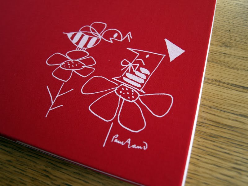
In the case of Little 1, no pun intended, when you remove the jacket, you discover a rather lovely illustration on the red cloth bound book.


Despite liking the image itself for its simplistic beauty, what really chimes with me about this is that it makes the whole book interactive, and creates a reveal within the construct of the artefact. As both child and adult, this tactic has always engaged me and made me feel more personally attached to an item. That act of discovery on the part of the user is an important design device that helps to bond them with the product on a deeper emotional level. Without the dust jacket, this would just become the cover image—nice as it is—but I wager it wouldn't carry the same impact.

Of course, designers should always be looking for ways to utilise all components, especially in times of environmental concerns. The Design Series Format books seem incredibly wasteful when thinking along these lines. If you insist of having a dust jacket that is going to be printed on, then at least do something with it. An example I came across several years ago is Change The World For A Fiver, which incorporates a poster on the inside of its dust jacket.


I thought it strange when I bought it that this paperback book should have an extra wrapper, but on getting it home and looking under the cover, I discovered why.

A more recent example I've found is The Beach Beneath The Street by McKenzie Wark. This is in keeping with the situationist metaphor, 'underneath the paving stones, the beach', (referring to the sand beneath the paving slabs that student demonstrators, in Paris May 1968, ripped up to throw at riot police). The difference being that in book form, underneath the book jacket lies a graphic novel, which helps to contextualise some of the theories contained within the writing in the book.


Links:
Wikipedia on dust jackets
Ben Terrett on dust jackets
The dust jacket is dead, according to the Guardian in 2010
Buy old dust jackets

Monday, 14 November 2011

So I don't have to...

A summary by Neil McGuire of the Critical Tensions conference at St Bride Library last week: Tense

Friday, 11 November 2011

This monkey's gone to heaven

I'm currently sitting in St Bride waiting for the second day of the foundation's tenth annual conference, Critical Tensions, to start. The train journey down was accompanied by the Pixies, in honour of the first speaker of the day, Vaughan Oliver, the man behind 4AD record label's visual identity. A long time admirer, I'm looking forward to hearing him speak about his work.

The event has thrown up some interesting topics of conversation already. One of the reoccurring themes for me, much like the Graphic Design: History In The Making conference I came to earlier this year, is the lack of recognition graphic design gets relative to other creative arts. I'm slowly building a cannon of examples when this topic raises its head in lectures, conferences and general conversations. This doesn't just seem a prevalent topic among practitioners, design journalists and historians; first year students at UCS, relatively new to Graphic Design, are picking up on this as well. Expect more posts here on this in the future.
That's not to say that this is all that is being discussed here. Certainly not, and all naval gazing aside, during Critical Tensions yesterday it was great to hear some of the stories behind Jonathan Barnbrook's fonts; Gerry Leonidas spoke about typographic structure still being defined and restricted by books and newspapers when these formats are increasingly less relevant in non-paper based design; Alan Kitching showcasing new and old work; and Tom Ferrand looked at breaking tradtional ways of working to inject fresh thinking and innovation in the not for profit sectors through the Design For Nothing project.

For more details about the conference, see the previous post on Dubdog for a link to Eye's take on the morning session yesterday, (and see if you can spot me in the audience—this is the second St Bride event I've been to and ended up on Eye blog as a result).

Apologies for no links in this post, I'm writing this on the go, and will provide a list at the end of the two days.

Friday, 28 October 2011

Childhood Remixed


I've been working on an identity for some colleagues at University Campus Suffolk recently. The first unveiling of the results came this week, with the above logo, in a call for submissions for Childhood Remixed, an electronic academic research journal themed on childhood. There's more work to do on designing the publication itself over the coming months as submissions come in and are peer reviewed.

The launch of the first issue is expected in spring 2012 and will initially only be available to those from within the institution. This PDF based downloadable journal will act as a publishing opportunity for UCS staff, alumni, postgraduate students and final year undergraduates producing both written and image based work.

Wednesday, 5 October 2011

Stoned

I got the new Roots Manuva CD, 4everevolution, through the post today and was immediately struck by the track listing on the reverse.


From the photographs I'd previously seen of the cover, I hadn't realised that what I was looking at was a real stone carving. However, this is clearly the case seeing the reverse. Stone carving is very beautiful when done well, and the type here demonstrates that. I was also drawn to the fact that the process is on display. Rather than seeing the finished article, we get the see the sketching—the marking out—before the chisel has finished all its strokes and the chalk is washed away.


On the inner sleeve the demonstration of process is continued with the stone that forms the front cover shown in the studio of stone carver Jim Kirby.


Designed by Oscar & Ewan, this theme is followed through into the CD booklet, where Rodney Smith's (Roots Manuva) own process is on show, that of his handwritten lyrics. Roots has always been a great wordsmith, twisting words and syllables to fit his dub and hip hop hybrid rhythms, and I've often wondered how he writes. Whether these are first drafts or rewrites is not known, but that doesn't matter. In both stone carving and in Smith's lyrics, we are actually seeing the hand of the artist and that brings a human resonance to fore in this ultra digital age. And while Kirby's hand is literally set in stone, Smith's is formed on paper to later be recorded and evolve into some form of cultural permanence through the tunes we hear as listeners that get lodged in our minds.

It's rare that a CD sleeve provokes so much thought in my mind before I've even heard it. I'm looking forward to getting to know this piece of work if initial impressions are anything to go by.

Links:
Oscar & Ewan
Jim Kirby

Thursday, 22 September 2011

Diagramatic


A work colleague showed me some old board games he had knocking around the other day. These diagrams came from the instructions to a sub-subbuteo football game based on tiddlywinks. Due to the haircut and clothes of the guy playing table top football with two perfectly happy and grinning children on the photo on the box, we guessed the game dated from the 1960s.


What is it about the combination of sans serif, geometry, dotted lines, arrows, and red & black that will always appeal to me?