
McJunk total at end of 2010 = 505
McJunk total at close of 2011 = 830
Hmmmm. McHappy New Year!

Saturday, 31 December 2011
325 in 365
Thursday, 29 December 2011
Talk to a brick wall

I saw this scrawled on a pavement in Ipswich yesterday. Is this a very concrete form of Brian Eno / Peter Schmidt's Oblique Strategies?
Tuesday, 27 December 2011
This is what a year sounds like, 2011
Well, here is the annual round up of what I've been listening to this year; be it bought, given or burnt.
It's been a strange but good year musically. Many of my favourite artists released something, and only a few were disappointing. Bonnie 'Prince' Billy's Wolfroy Goes To Town is his best for a while, and Wire still have it—Red Barked Tree hasn't been far from my headphones all year. The critics got it largely right with PJ Harvey, and it was right that she was recognised for such a major work, although I would also have cheered had King Creosote & Jon Hopkins got the Mercury Prize instead. Björk proved she doesn't need app gimmickry to still make compelling music. The Fall and Magazine were both great live, and while I like both of their 2011 albums, neither stand up to what were exhilarating live performances. Tom Waits was Tom Waits and Mogwai were Mogwai—who would want either of them any other way? Beastie Boys made me smile again, that is until I got tired of Hot Sauce after about eight listens. There is enough that is good on Roots Manuva's 4everevolution to tip its balance away from lacklustre. Unfortunately, I found King of Limbs to be a bit featureless with only a few moments of clarity—if only The Daily Mail and Staircase had been included to give it a little more texture. Robert Wyatt got in there during 2011, sort of, with The Unthanks live recording of some of his and Anthony Johnson's work. And lastly for the ancient's, appropriately the album that has tickled my fancy of late is the bizarre folk world of those post-punkers The Mekons with Ancient & Modern.
So, that's the oldies out of the way, many of them making better new music than younger artists. Where are the decent new bands and artists of creative integrity? They are few and far between on my radar, although I'm prepared to believe my modes of delivery may be slightly to blame for me not finding them. There's got to be more life out there!
Of the new acts I did discover, (I'm painfully aware some of these have been around for a while), DELS astounded everyone by not hiding the fact he's from Ipswich and making a truly interesting record; the boy has a bright future. On a guitar kick, Bo Ningen's noise screech, one year old but heard by me for the first time this year on Mark Riley's 6music show, was a trip down memory lane and provided a balance that ideally complimented Iceage's punk thrash. I discovered both bands in the same week and though they were more refreshing than brilliant, they awakened an old aesthetic in me that I'd long ago dismissed no one could do justice to again. Impressed by Warpaint's live Glastonbury set—seen on Freeview, I only go to folk festivals these days—I bought The Fool, but I was disappointed it didn't have the same sonic dynamism of their live performance. However, above and well beyond anything listed so far in this post, the new (to me) artist who knocked me for six this year was Merill Garbus's Tune-Yards. Her far from singular vision that was the album Whokill had me considering influences as wide and disparate as; The Slits, Nina Simone, Pil circa Flowers of Romance, Adam & The Ants, Solex, Vampire Weekend and Polar Bear. All this was forced through a crude fucked up splicing machine, which for me, defined 2011 much better than any other music I heard all year. Here's a sample for the uninitiated:
That said, my favourite album of the year actually came out last year. For some reason I resisted buying it at the time and it took some friends to get it for me as a birthday present this year for me to hear it's brilliance, (thanks to the Allpresses). It is the Tradi-Mods vs Rockers Congotronics compilation where post-rock artists rework and remix tracks by the likes of Konono No1 and Kasai Allstars. I couldn't possibly do justice to the album here, but this clip should go some way to showcasing its unique soundscape. This is a film of a collaborative tour that was thrown up in the wake of Tradi-Mods vs Rockers release:
Kinshasa Superband Promo Reel (english subtitles) from pierre Laffargue on Vimeo.
The list:
Sons of Joy - Sons of Joy EP
Wire - Red Barked Tree
Wire - Strays EP
British Sea Power - Valhalla Dancehall
The Jesus & Mary Chain - Upside Down, The Best of…
Prince - Sign O The Times
Wire - The Ideal Copy
Consolidated - The Myth Of Rock
Akron/Family - S/T II: The Cosmic Birth and Journey of Shinju TNT
The Streets - Computers and Blues
PJ Harvey - Let England Shake
Various - Froots/Folk Against Fascism compilation
Radiohead - The King Of Limbs
Mogwai - Hardcore Will Never Die, But You Will
The Beatles - White Album
Gil Scott-Heron & Jamie xx - We're New Here
King Creosote & Jon Hopkins - Diamond Mine
The Beatles - Abbey Road
Flux of Pink Indians - The Fucking Cunts Treat Us Like Pricks
TV On The Radio - Nine Types Of Light
DELS - Gob
African Head Charge - Voodoo Of The Godsent
Max Romeo & The Upsetters - War Ina Babylon
Gorillaz - The Fall
Kode9 & The Spaceape - Black Sun
Varous - The Ugly Truth About Ipswich
Metronomy - The English Riviera
Magazine - Play.+
Buzzcocks - Spiral Scratch EP
Kate Bush - Hounds of Love
Magazine - Magic, Murder And The Weather
Beastie Boys - Hot Sauce Committee Part Two
Flux Of Pink Indians - Strive To Survive Causing Least Suffering Possible + Neu Smell
Crass - The Crassical Collection: Christ The Album, Yes Sir I Will
Kasai Allstars - Kasai Allstars
Aidan Moffat + The Best-Ofs - How To Get To Heaven From Scotland
Lou Reed - The Raven
Burial - Street Halo EP
DJ Shadow - I Gotta Rokk EP
Lee 'Scratch' Perry - The Return Of Sound System Scratch
Tune-Yards - Whokill
Sons & Daughters - Mirror Mirror
Scientist - Scientist Launches Dubstep Into Outer Space
Warpaint - The Fool, Exquisite Corpse EP
Brian Eno - Drums Between The Bells
Lou Reed - Ecstasy
Velvet Underground - White Light/White Heat
Various - Invasion Of The Mysteron Killer Sounds : 3D Dancehall Digital Dub
Lou Reed - Growing Up In Public
Various - The Wire Tapper 26
Various - Caveat Emptor
Andy Moor and Yannis Kyriakides - Empire Abroad, Surveillance At Home
Various - Tradi-Mods vs Rockers
Little Dragon - Ritual Union
Steve Mason & Dennis Bovell - Ghosts Outside
Public Image Ltd. – Plastic Box
Gang Of Four – Content
The Who - The Who Sell Out
The Jam - In The City, This Is The Modern World, Setting Sons, Sound Affects, All Mod Cons
King Creosote - Bombshell
Captain Beefheart & His Magic Band - Trout Mask Replica
Radiohead - The King of Limbs Remixes
Bjork - Homogenic
Pete and the Pirates - One Thousand Pictures
Iceage - New Brigade
Bo Ningen - Bo Ningen
Half Man Half Biscuit - 90 Bisodol (Crimond)
Thee Oh Sees - Castlemania
Roots Manuva - 4everevolution
Magazine - No Thyself
Björk - Biophilia
Jeffrey Lewis – A Turn In The Dream-Songs
Bonnie 'Prince' Billy – Wolfroy Goes To Town
Tom Waits – Bad As Me
Lou Reed – Take No Prisoners
Iggy Pop – TV Eye
Nick Cave – Kicking Against The Pricks
Dave and Ansel Collins – Double Barrel
The Stranglers – X Cert
Scott Walker and The Walker Brothers – The Best of
Kate Bush - 50 Words For Snow
Gillian Welsh - The Harrow and The Harvest
The Mekons - Ancient & Modern 1911-2011
The Fall - Ersatz GB
The Unthanks - Diversions, Vol 1: The Songs of Robert Wyatt and Antony & The Johnsons
Low – C'mon
Sugar Minott – Reggae Anthology: Hard Time Pressure
Sons of Joy – Songs of Joy
King Midas Sound – Without You
Mark Stewart – Nothing Is Sacred
The Kinks – The Kink Kontroversy
The Pioneers – Long Shot
Jello Biafra And The Guantanamo School Of Medicine – Enhanced Methods Of Questioning
Tune-Yards – Bird-Brains
Wednesday, 21 December 2011
The mysterious case of the Christie typeface
My wife likes to read books in the bath. Due to this we have a growing collection of charity shop bought Agatha Christie books on the windowsill of our bathroom, with the paper getting slowly damaged by the changing humidity therein.
Apart from worrying about the condition of the books, I haven't really paid much attention to this collection until the other day. For some reason I decided to check out the covers, and I immediately noticed the lack of cohesion in the choice of typefaces used. This is particularly striking when looking at the one consistent feature of these covers; Agatha Christie's name. To illustrate my point, below are scans of a selection of our bathroom books ranging from 1956 to 2002 .

1956

1960

1971

1976


c.1995 (American edition with no date in book—1995 noted on price tag sticker)


1980

1981

c.1995 (American edition with no date in book—1995 noted on price tag sticker)

2002
As an experiment, before scanning these in, I laid them out in the order I thought they were released in, based on the choice of typeface. Apart from one—the 1980 Helvetica rendering that I thought was late 1960s—I got the order spot on.
As an experiment, before scanning these in, I laid them out in the order I thought they were released in, based on the choice of typeface. Apart from one—the 1980 Helvetica rendering that I thought was late 1960s—I got the order spot on.
Considering the attention to detail that is lavished on TV adaptations and films of Christie's work, in terms of getting date specific references for architecture, clothing and product design correct, I find it interesting how typographic details on these books are rooted in the time of the reprint's release, rather than paying any attention to the context of the book.
Monday, 19 December 2011
Flailing
Different methods of getting in touch with Innocent drinks company:

I particularly like the idea of getting in touch via the medium of interpretive dance.


I particularly like the idea of getting in touch via the medium of interpretive dance.

Sunday, 18 December 2011
Go2 Kontroversy
Yesterday in Southwold, I happened upon a CD Fair. That was pretty much the rest of the afternoon written off!

Trawling through the 1960s section, I found some Kinks. Owning only Something Else and Village Green Preservation Society on CD, and a greatest hits compilation, I snapped up The Kink Kontroversy. And what a great record it is.
However, music aside, the back sleeve was intriguing. At first glance it is standard fair for a 60s release. Title, track listing and blurb about the band.

But on closer inspection the copy involves a lot of humour which mocks the band—such as bemoaning poor Pete for singing on Till The End Of The Day—which I thought was quite brave for 1965.

Then, as I read the Michael Aldred penned piece about the band, I got the feeling that it seemed somewhat familiar.

After a few minutes I worked out what it reminded me of; XTC's sleeve for Go2 (below), by Hipgnosis. I have always considered this sleeve to be an ironic postmodern masterpiece, in terms of sleeve design, and further to this, I had also previously thought of it as being completely original. Now I'm wondering whether I'm right in that assumption. Not that this new knowledge changes my view of the brilliance of Go2, everyone has to get their inspiration from somewhere, and Hipgnosis developed the concept much further and took it to its logical conclusion.
Compare the two pieces and make up your own mind about whether the 1978 post-punk classic below is indebted to the 1965 mod original above. (Click on images for larger view).


Friday, 16 December 2011
Closing shops
I hope that the trend for closing up shop doesn't increase, as this week, Design Assembly blog announced its closure after 3 years of excellent design writing. If you haven't seen the blog previously, they are honouring its memory with 3 books, available here. My copy is on order.

This comes a few weeks after Airside announced they were winding down next year, see the Creative Review article about it here.

This comes a few weeks after Airside announced they were winding down next year, see the Creative Review article about it here.
Saturday, 10 December 2011

Saturday, 3 December 2011
Turner trailer
I've just seen the Channel 4 trailer for their Turner Prize 2011 coverage, and my gut instinct was that is was yet another quality output from Why Not Associates, and I wasn't wrong—a quick look at the WNA website and I find that they did indeed do this.
In the usual end of year polls, Why Not Associates have got to come top in the design company category. Equally adapt at turning their skills to good use for corporate and cultural clients, their work just get better and better in my opinion.
Why Not Associates' website
In the usual end of year polls, Why Not Associates have got to come top in the design company category. Equally adapt at turning their skills to good use for corporate and cultural clients, their work just get better and better in my opinion.
Why Not Associates' website
Tuesday, 29 November 2011
Post-postmodernism
Today I spent a very pleasant day at the V&A with first year UCS graphic design students looking around the Postmodernism exhibition. A little overwhelming at first, it is an intense visual overload that thrusts itself into your eyeballs. But despite this, there is much to like.
Divided into three main rooms, each split into different sections, you get a glimpse of where you are heading as you walk around. A hole in a wall, to lead the eye to what is around the corner; the sound of a video filtering into a neighbouring section; brightly coloured semi-transparent plastic strip curtains hiding corridors; and neon arrows directing you between rooms—regardless of the work on display, it is a well laid out show that visually, and aurally pulls you through it.
The students clearly responded well to an area dedicated purely to graphic design, which is rare outside of specialist galleries and the Design Museum. This was far braver than the V&A Modernism exhibition circa 2006 where graphic design was sidelined. All the expected works were there. Saville, Bubbles, Griemann, Brody, Scher etc. It was a little like walking through the postmodern chapter in a graphic design history book, but good to see in the flesh, none-the-less. I thought the graphic design section seemed the most sober and serious of the whole exhibition, as if the printed page that work appears on contained and controlled the work, unlike the frankly bizarre range of teapots and pop celebrity clothing on display.
I have a bit of a love/hate relationship with Postmodernism, outside of graphic design, but I thoroughly enjoyed the exhibition. It'll be interesting to hear what the students made of it when I'm next with them on Friday, especially as I don't usually teach Postmodernism until next semester, so they went only knowing what contexts I could deliver to them in a hastily put together 45 minute lecture, and what the exhibition text told them.
Saturday, 26 November 2011
Underneath the cover, the…
Over the summer, for some reason, I ended up reading a lot of hardback books. Biographies and autobiographies mostly. Doing so, I got to thinking about dust jackets, and how most were really poorly designed, and were only there to make the book stand out on Waterstones' bookshelves. These flimsy paper wraps really don't offer any real protection to the hard casing, as was their original intention.
How these jackets helped the books stand out from other biographies seems difficult to comprehend as well, considering many follow a pattern of large cropped portrait of the author/subject with large sans serif type writ large, such as the cover for Andy Kershaw's painfully honest autobiography.

On removing these covers, and I always take a peek, you generally discover an equally dull hard case with the title printed large on the spine.

Interestingly, at the same time I was having these thoughts about dust jackets, Ben Terrett of Noisy Decent Graphics blogged about the topic, stating that the first thing he does on getting a hard backed book is to throw away the dust jacket, (link below).
I can see his point, but I prefer to keep mine covered, despite the fact that the jackets become tatty over the course of reading the book. The main reason being that the flaps work as great place savers. I'm not a fan of book marks or torn scraps of paper wedged in between pages. I somehow lose them during the course of reading a book—I'm never quite sure how this happens because the book marks should surely stay with the books! Also, I'm never quite sure what to do with them when I'm in-between books. Paperbacks aren't a problem, as I commit the mortal sin, (according to some people), of turning down the corner of the page I'm on. Unless, of course, it's a book I've borrowed—I do have some respect.
So while I do see dust jackets as mostly pointless, they do have their uses. However, what does really annoy me is when the dust jacket is exactly the same as an image wrap on a hard case. The otherwise excellent Design Series Format by Brian Webb is a perfect example of this.

However, there are gems out there that demonstrate how dust jackets can become an integral part of the design. For example, Ann and Paul Rand made the most in their children's books, Sparkle And Spin and Little 1. Sparkle And Spin literally sparkles, by incorporating a glitter ink as an element within the design.

And if you take a peak underneath the jacket, which I always do with any books I pick up, you find the image wrap is different from the jacket and there's the lovely personal touch of the author's signatures.

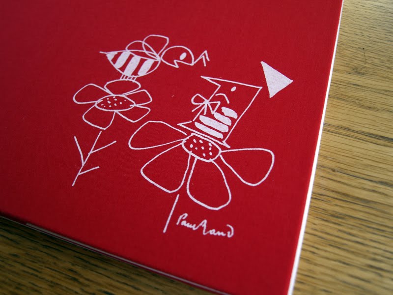
In the case of Little 1, no pun intended, when you remove the jacket, you discover a rather lovely illustration on the red cloth bound book.


Despite liking the image itself for its simplistic beauty, what really chimes with me about this is that it makes the whole book interactive, and creates a reveal within the construct of the artefact. As both child and adult, this tactic has always engaged me and made me feel more personally attached to an item. That act of discovery on the part of the user is an important design device that helps to bond them with the product on a deeper emotional level. Without the dust jacket, this would just become the cover image—nice as it is—but I wager it wouldn't carry the same impact.
Of course, designers should always be looking for ways to utilise all components, especially in times of environmental concerns. The Design Series Format books seem incredibly wasteful when thinking along these lines. If you insist of having a dust jacket that is going to be printed on, then at least do something with it. An example I came across several years ago is Change The World For A Fiver, which incorporates a poster on the inside of its dust jacket.

I thought it strange when I bought it that this paperback book should have an extra wrapper, but on getting it home and looking under the cover, I discovered why.
A more recent example I've found is The Beach Beneath The Street by McKenzie Wark. This is in keeping with the situationist metaphor, 'underneath the paving stones, the beach', (referring to the sand beneath the paving slabs that student demonstrators, in Paris May 1968, ripped up to throw at riot police). The difference being that in book form, underneath the book jacket lies a graphic novel, which helps to contextualise some of the theories contained within the writing in the book.


Links:
Wikipedia on dust jackets
Ben Terrett on dust jackets
The dust jacket is dead, according to the Guardian in 2010
Buy old dust jackets
How these jackets helped the books stand out from other biographies seems difficult to comprehend as well, considering many follow a pattern of large cropped portrait of the author/subject with large sans serif type writ large, such as the cover for Andy Kershaw's painfully honest autobiography.

On removing these covers, and I always take a peek, you generally discover an equally dull hard case with the title printed large on the spine.

Interestingly, at the same time I was having these thoughts about dust jackets, Ben Terrett of Noisy Decent Graphics blogged about the topic, stating that the first thing he does on getting a hard backed book is to throw away the dust jacket, (link below).
I can see his point, but I prefer to keep mine covered, despite the fact that the jackets become tatty over the course of reading the book. The main reason being that the flaps work as great place savers. I'm not a fan of book marks or torn scraps of paper wedged in between pages. I somehow lose them during the course of reading a book—I'm never quite sure how this happens because the book marks should surely stay with the books! Also, I'm never quite sure what to do with them when I'm in-between books. Paperbacks aren't a problem, as I commit the mortal sin, (according to some people), of turning down the corner of the page I'm on. Unless, of course, it's a book I've borrowed—I do have some respect.
So while I do see dust jackets as mostly pointless, they do have their uses. However, what does really annoy me is when the dust jacket is exactly the same as an image wrap on a hard case. The otherwise excellent Design Series Format by Brian Webb is a perfect example of this.

However, there are gems out there that demonstrate how dust jackets can become an integral part of the design. For example, Ann and Paul Rand made the most in their children's books, Sparkle And Spin and Little 1. Sparkle And Spin literally sparkles, by incorporating a glitter ink as an element within the design.

And if you take a peak underneath the jacket, which I always do with any books I pick up, you find the image wrap is different from the jacket and there's the lovely personal touch of the author's signatures.

In the case of Little 1, no pun intended, when you remove the jacket, you discover a rather lovely illustration on the red cloth bound book.

Despite liking the image itself for its simplistic beauty, what really chimes with me about this is that it makes the whole book interactive, and creates a reveal within the construct of the artefact. As both child and adult, this tactic has always engaged me and made me feel more personally attached to an item. That act of discovery on the part of the user is an important design device that helps to bond them with the product on a deeper emotional level. Without the dust jacket, this would just become the cover image—nice as it is—but I wager it wouldn't carry the same impact.
Of course, designers should always be looking for ways to utilise all components, especially in times of environmental concerns. The Design Series Format books seem incredibly wasteful when thinking along these lines. If you insist of having a dust jacket that is going to be printed on, then at least do something with it. An example I came across several years ago is Change The World For A Fiver, which incorporates a poster on the inside of its dust jacket.

I thought it strange when I bought it that this paperback book should have an extra wrapper, but on getting it home and looking under the cover, I discovered why.
A more recent example I've found is The Beach Beneath The Street by McKenzie Wark. This is in keeping with the situationist metaphor, 'underneath the paving stones, the beach', (referring to the sand beneath the paving slabs that student demonstrators, in Paris May 1968, ripped up to throw at riot police). The difference being that in book form, underneath the book jacket lies a graphic novel, which helps to contextualise some of the theories contained within the writing in the book.


Links:
Wikipedia on dust jackets
Ben Terrett on dust jackets
The dust jacket is dead, according to the Guardian in 2010
Buy old dust jackets
Tuesday, 22 November 2011

Monday, 14 November 2011
So I don't have to...
A summary by Neil McGuire of the Critical Tensions conference at St Bride Library last week: Tense
Sunday, 13 November 2011
Critical (mis)quotes
"Never ask permission to do anything, just do it.
Then keep doing it until someone tells you to stop."
Alan Kitching, Critical Tensions Conference, St Bride Library. 10.11.11
Then keep doing it until someone tells you to stop."
Alan Kitching, Critical Tensions Conference, St Bride Library. 10.11.11

Friday, 11 November 2011
This monkey's gone to heaven
I'm currently sitting in St Bride waiting for the second day of the foundation's tenth annual conference, Critical Tensions, to start. The train journey down was accompanied by the Pixies, in honour of the first speaker of the day, Vaughan Oliver, the man behind 4AD record label's visual identity. A long time admirer, I'm looking forward to hearing him speak about his work.
The event has thrown up some interesting topics of conversation already. One of the reoccurring themes for me, much like the Graphic Design: History In The Making conference I came to earlier this year, is the lack of recognition graphic design gets relative to other creative arts. I'm slowly building a cannon of examples when this topic raises its head in lectures, conferences and general conversations. This doesn't just seem a prevalent topic among practitioners, design journalists and historians; first year students at UCS, relatively new to Graphic Design, are picking up on this as well. Expect more posts here on this in the future.
That's not to say that this is all that is being discussed here. Certainly not, and all naval gazing aside, during Critical Tensions yesterday it was great to hear some of the stories behind Jonathan Barnbrook's fonts; Gerry Leonidas spoke about typographic structure still being defined and restricted by books and newspapers when these formats are increasingly less relevant in non-paper based design; Alan Kitching showcasing new and old work; and Tom Ferrand looked at breaking tradtional ways of working to inject fresh thinking and innovation in the not for profit sectors through the Design For Nothing project.
For more details about the conference, see the previous post on Dubdog for a link to Eye's take on the morning session yesterday, (and see if you can spot me in the audience—this is the second St Bride event I've been to and ended up on Eye blog as a result).
Apologies for no links in this post, I'm writing this on the go, and will provide a list at the end of the two days.
Thursday, 10 November 2011
Saturday, 5 November 2011
Thank you
A big thank you to Artists of Walberswick for dedicating space in their bi-annual exhibition last weekend to some of the many paintings by my Uncle, Terry Ball, who died earlier this year.

Self-portrait, circa 1949, submission 11 of 15 for entry into the Royal College of Art
View photographs of the exhibition and other work on Flickr.
Terry Ball's obituary in The Guardian

Self-portrait, circa 1949, submission 11 of 15 for entry into the Royal College of Art
View photographs of the exhibition and other work on Flickr.
Terry Ball's obituary in The Guardian
Friday, 4 November 2011
Starling wasn't stallin'
Shame about the music, but full screen this for some Friday evening wonder.
Via Swissmiss
Murmuration from Sophie Windsor Clive on Vimeo.
Via Swissmiss
Sunday, 30 October 2011
Brooks goes sabbing
Great little short video about the making of the new Brooks saddles advert that marries anti-fox hunting and cycling. I'm not sure which it makes me want to do, go and sabotage a hunt or buy a new leather saddle, but either way, it's stylishly done.
Link:
Brooks
Link:
Brooks
Friday, 28 October 2011
Childhood Remixed

I've been working on an identity for some colleagues at University Campus Suffolk recently. The first unveiling of the results came this week, with the above logo, in a call for submissions for Childhood Remixed, an electronic academic research journal themed on childhood. There's more work to do on designing the publication itself over the coming months as submissions come in and are peer reviewed.
The launch of the first issue is expected in spring 2012 and will initially only be available to those from within the institution. This PDF based downloadable journal will act as a publishing opportunity for UCS staff, alumni, postgraduate students and final year undergraduates producing both written and image based work.
Sunday, 23 October 2011

Saturday, 15 October 2011
Two ends of a spectrum
Today I've been impressed by two items of publishing, both at opposite ends of the media/medium's spectrum.
Firstly, this morning I got my first copy of Varoom through the post. For those who don't know, it is the magazine of the Association of Illustrators. We'll, it used to be, it is now the newspaper of the Association of Illustrators. It is sensitively designed, beautifully laid out, and, suiting its content, tactile. Intelligent writing about contemporary illustration and its relation to society, graphic design and art make this a fully formed publication and it is stuffed with great work.
What is really interesting about this publication though, is that it has rejected its previously 'glossy' magazine format as a response to the economic crisis on everyones doorstep. This has resulted in the price dropping to an affordable £15 for 4 issues (one issue free for subscribers), with no change to its previous high editorial standards. I've only read Varoom in libraries, or been loaned someone else's copy, but I can immediately see this new stance of change for survival sake, sets it apart from many other design/illustration magazine's out there. Instead of trying to impress with some major stylistic overhaul, it has zagged where everyone else is zigging, and is all the better for it. Eye and Creative Review are great magazines for different reasons, and I will continue to get both until they give up due to falling sales, and, I suspect, the strength of the free content available on their blogs. But Varoom really does beat Grafik–which is untrust worthy in its existence, having nose dived several times in the 10 years I've been reading it–and It's Nice That, which is a new kid on the block. While being well produced with varied content, which strangely makes it more transitory than interesting, it does tend to be much more of a surface read and concerned with the über trendy. But then a magazine with the word 'nice' in the title always was going to be more of a showcase rather than a critique.
So, onto my second revelation of the day; I downloaded The Guardian iPad app this morning. I wasn't expecting much, to be honest. I like the paper edition, and usually flit between that and the website depending on whether I want to sit, read and contemplate, or whether I want to get the most up to the minute information. I wasn't sure this was going to be anything other than forced content. However, after 10 minutes getting to grips with how it functions, I must say I'm impressed. It's certainly better than the website in terms of making you feel like you are navigating through the days paper edition. And as long as you've wifi connectivity, it links to the most recent stories on their website, (and external sources). This, on first impressions, is a real contender to the print edition and certainly beats the New York Times app, the only other newspaper app I've downloaded, (but stopped using once I had to pay for it). The layout of the articles is logical, it is clear how to get between stories, suggests other stories that relate, and like the paper edition, as opposed to the website, each page feels like it belongs to the whole. One of the things I don't like about guardian.co.uk is that when I jump to an article, because of the greater blank space around it, I feel like I've left the main website. In design terms, the app has the sense of cohesion between different elements that is lacking online. In this, the design team behind this app have managed to make the interaction relate much more to the paper version than the website, which is an impressive feat in itself.
Whether I will completely go over to the app version once my free trial runs out, or still continue to buy the daily print version, is difficult to say. During the week I can get the paper cheap from the Student Union shop at work. The paper version also gets me away from a screen for a while, which is always a good thing. However, the advantages of getting the Saturday edition for the iPad was that I didn't get the frustraitingly ultra-middle class Weekend magazine, (apart from the odd article). But then I didn't get the excellent Guide either. Nor does the print edition's commitment to commissioning contemporary illustrators seemed to have made it across the digital divide. So I guess I'll have to use my few months free trial wisely to assess the pros and cons between print and digital, but on the current evidence, this app will set the bar for many other cross overs.
Tuesday, 11 October 2011

Sunday, 9 October 2011

Thursday, 6 October 2011
Steve Jobs: The man who changed everything
There's lots I could say about the sad passing of Steve Jobs, just like every other design related blog out there. However, why repeat when someone else does such a good job of saying it. Read Creative Review's article here: Creative Review - Steve Jobs: The man who changed everything
R.I.P Steve Jobs
R.I.P Steve Jobs
Wednesday, 5 October 2011
Stoned
I got the new Roots Manuva CD, 4everevolution, through the post today and was immediately struck by the track listing on the reverse.

From the photographs I'd previously seen of the cover, I hadn't realised that what I was looking at was a real stone carving. However, this is clearly the case seeing the reverse. Stone carving is very beautiful when done well, and the type here demonstrates that. I was also drawn to the fact that the process is on display. Rather than seeing the finished article, we get the see the sketching—the marking out—before the chisel has finished all its strokes and the chalk is washed away.

On the inner sleeve the demonstration of process is continued with the stone that forms the front cover shown in the studio of stone carver Jim Kirby.

Designed by Oscar & Ewan, this theme is followed through into the CD booklet, where Rodney Smith's (Roots Manuva) own process is on show, that of his handwritten lyrics. Roots has always been a great wordsmith, twisting words and syllables to fit his dub and hip hop hybrid rhythms, and I've often wondered how he writes. Whether these are first drafts or rewrites is not known, but that doesn't matter. In both stone carving and in Smith's lyrics, we are actually seeing the hand of the artist and that brings a human resonance to fore in this ultra digital age. And while Kirby's hand is literally set in stone, Smith's is formed on paper to later be recorded and evolve into some form of cultural permanence through the tunes we hear as listeners that get lodged in our minds.
It's rare that a CD sleeve provokes so much thought in my mind before I've even heard it. I'm looking forward to getting to know this piece of work if initial impressions are anything to go by.
Links:
Oscar & Ewan
Jim Kirby
Saturday, 1 October 2011
Thursday, 22 September 2011
Diagramatic

A work colleague showed me some old board games he had knocking around the other day. These diagrams came from the instructions to a sub-subbuteo football game based on tiddlywinks. Due to the haircut and clothes of the guy playing table top football with two perfectly happy and grinning children on the photo on the box, we guessed the game dated from the 1960s.

What is it about the combination of sans serif, geometry, dotted lines, arrows, and red & black that will always appeal to me?
Saturday, 17 September 2011
A town called modest

Rabobank riding through Christchurch Park without a parkie in sight
I've never previously understood the phrase, "it'll be good for the town", often repeated by local newspapers and parochial councillors talking up some event. I heard a local official stating it on the radio yesterday when talking about the Tour of Britain. I could never quite work out what was meant by 'good', always assuming that whoever was saying it meant financially. Cynically I thought, 'great, so the local Chamber of Commerce is happy, but what about the people working in shitty jobs for crap money'. But today I got a sense that the phrase was as much about the perception of where you live. There are a lot of positive things happening in Ipswich at the moment, culturally and socially. Its not perfect, obviously, and lots of opportunities aren't being realised, but the Tour of Britain coming to Ipswich today did feel 'good'. It was great to watch the riders come through a local park as crowds lined the paths and cheered them on.
The Tour of Britain website says of Ipswich, "…the birthplace of Cardinal Wolsey [is] a modest town with a big ambition. Ipswich is in the throes of cultural renaissance now boasting a state-of-the-art new DanceHouse and University located along the rejuvenated Waterfront amongst a bevy of bistros and restaurants."
A modest town with big ambitions. I'll settle for that.
Thursday, 15 September 2011

Sunday, 11 September 2011
Up above the streets and houses

Claire and I took Timmy the dog for a walk in the rain yesterday early evening. As the clouds cleared away, a fantastic full double rainbow revealed itself. Unfortunately my camera phone was never going to be able to do justice to this amazing optical illusion but the photo above at least sets the scene. However, what was interesting, other than the natural visual phenomena itself, and the fact that a few other people also walking across the field stopped and gaped in awe just as Claire and I did, was that a train running along the bottom of the field slowed right down, we assume, to allow the passengers to gaze at this wondrous sight. It was one of those moments that demanded you look. Nothing else, just look.
Timmy largely ignored the spectacle.
Saturday, 10 September 2011

Thursday, 8 September 2011
Sunday, 4 September 2011
Plantation Garden, shhh!
Yesterday, Claire and I took my Mum to a 'secret garden' in Norwich that some friends introduced us to last year. Started in 1856, the garden was abandoned after the Second World War, but has been slowly restored since the 1980s. It is one of those special places that demands you sit back and relax in wonder.

However, the reason for me posting about it here is to showcase these wonderful 'medieval' walls that run around certain sections of the garden, lining the banks of what was once a chalk pit.

I love the fact that found remnants of different buildings appear to have just been shoved into the wall as seemed appropriate at the time, creating a bespoke folk art memorial of different dwellings from the local area. A complete hodgepodge, it juxtaposes amusingly against the more formal aspects of the garden.


Alongside this, there are church window arches and gargoyles placed in flower boarders, seemingly at random, that give the place a strange quirkiness not dissimilar in feel to Clough Williams-Ellis' Portmeirion.

If you are in Norwich and want to get out of the hustle and bustle, then it's well worth finding the time to pay the gardens a visit. Check The Plantation Garden website for more details of its history, restoration, and more importantly, how to get there. Just don't tell too many people.
Subscribe to:
Posts (Atom)