
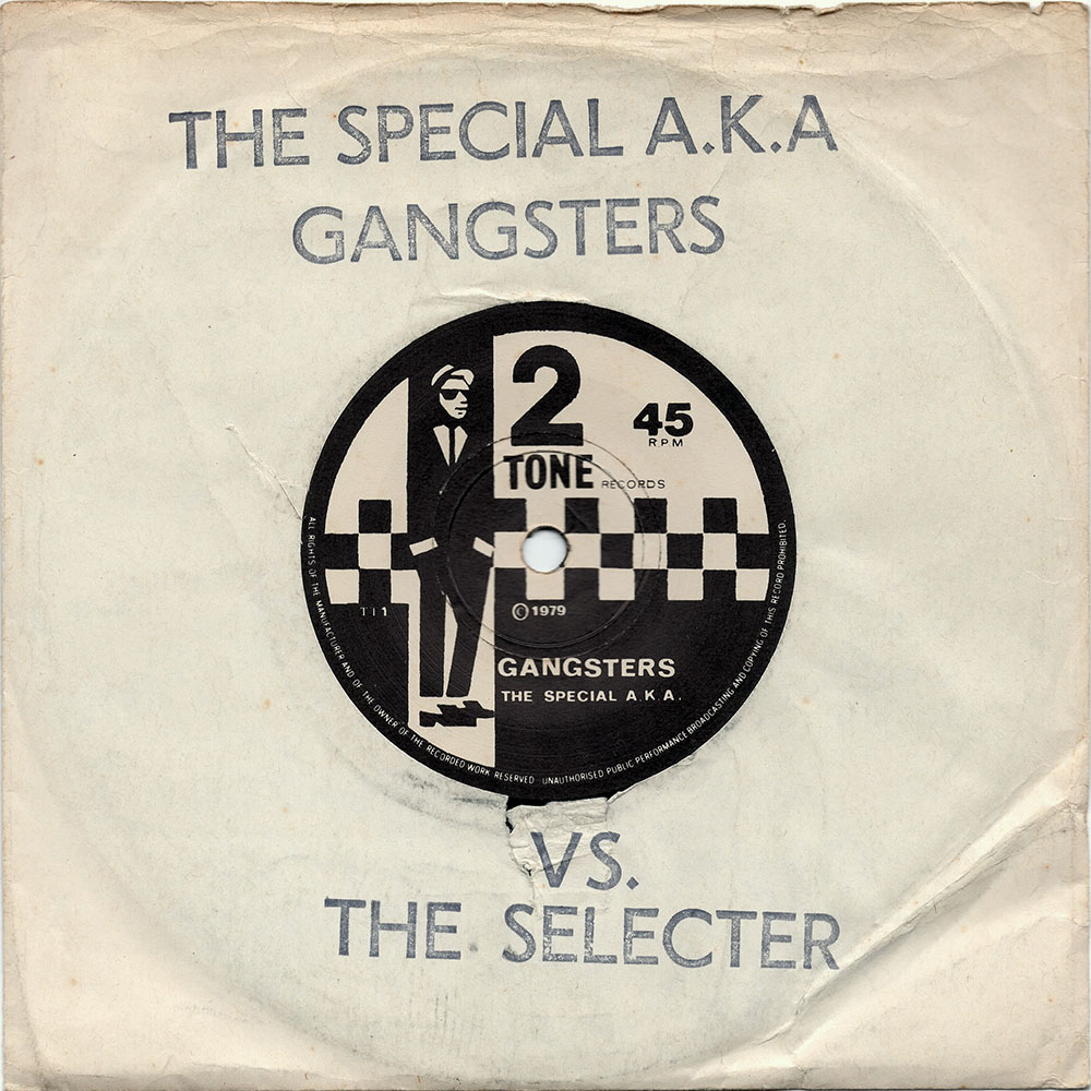
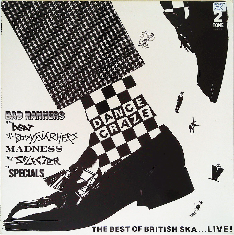
I had to put together a presentation recently about my personal work and how I got where I am now. It's interesting what dragging up the past can do for you! Anyway, as I was trawling through the work I did before I trained as a graphic designer - the hobby stuff I did for bands and political groups while working as a printer/finisher - I worked out where my graphic design roots were formed. I can blame no other than the British 2 Tone movement of the late 1970s, early 1980s. I loved The Specials, The Beat, The Selecter, Madness & The Bodysnatchers (never too keen on Bad Manners I'm afraid). I loved the mix of Ska music and punk attitude together with the dress sense and the social commentry reflecting the times. I also loved the whole movement's identity. Each band used a different font for their logo, some like the Selecter and Bodysnatchers used a bespoke typeface. I loved the black and white imagery and it's semiotics - each band was mixed race (with the exception of Madness) and all had an anti-racist ethic. And they all had their own little figurine. Madness had a squat 'M' wearing a pork-pie hat, the Beat had a dancing woman in tight skirt and headband and Jerry Dammers of The Specials devised the dancing cool dude Walt Jabsco icon for the 2 Tone label. Each was seen on their respective bands record sleeves. Then the film/LP Dance Craze was released and all logos and icons were on one sleeve. I was in seventh heaven. I'd sit and trace off these characters and different band logos and re-draw them, trying desperately to re-create them freehand. I'd cover my canvas school bag and school books with them. They were each individual but each had a sense of belonging. At thirteen this was powerful stuff. If only I'd have realised then that this was called Graphic Design and I might have progressed from my crap O' Level results to Art School instead of into the print trade and found my true vocation earlier in life.
Excellent history of 2 Tone website here.
This post was partially inspired by Michael Bierut's Our Little Secret posting on the Design Observer weblog about the film Helvetica and his typsetting love affair.
No comments:
Post a Comment